Crash Course in Scientific Computing
V. Plotting
Last lecture we have left the Conway's game of Life cellular automaton computing in arrays which were not very easy to visualize. Actually, we could have made a better job at displaying them for instance by using better characters to represent live and dead cells:
include("life.jl")
cleanspace(12);
putglider(6,6);
replace(space, 1=>*, 0=>-)

12×12 Array{Any,2}:
 -  -  -  -  -  -  -  -  -  -  -  -
 -  -  -  -  -  -  -  -  -  -  -  -
 -  -  -  -  -  -  -  -  -  -  -  -
 -  -  -  -  *  -  -  -  -  -  -  -
 -  -  -  -  -  *  -  -  -  -  -  -
 -  -  -  *  *  *  -  -  -  -  -  -
 -  -  -  -  -  -  -  -  -  -  -  -
 -  -  -  -  -  -  -  -  -  -  -  -
 -  -  -  -  -  -  -  -  -  -  -  -
 -  -  -  -  -  -  -  -  -  -  -  -
 -  -  -  -  -  -  -  -  -  -  -  -
 -  -  -  -  -  -  -  -  -  -  -  -
But a computer can do much better than that, by using computer graphics. This is an ample and complex problem, of which one can only hope to scratch the surface. That'll be providing plenty of material already.
For such a lecture deeply rooted on the graphical output, we will be using the notebook feature. This will allows us to keep all our graphs since the REPL would update them in a separate window. Jupyter (the notebook platform) has several shortcuts which it is handy to keep in mind when editing:
- One can toggle between edit (green) and command (blue) mode with esc and enter respectively.
- Use a and b to insert a cell above and below the current position.
- Use d d to delete the current cell
- Use z to undo
- Use m to transform a cell into markdown, which is the non-code part of the notebook that documents it. Further commands of the markdown are # for a section, ## for a subsection, etc. One can also use LaTeX there. We shall see some examples.
Plotting is not native in Julia, which you might regard as a pity, since it's such a fundamental aspect of computer programming. But this is actually a feature, as it allows us to choose the plotting environment that we like. We are not limited to built-in plotting capacities. We will be using Plots:
using Plots
This is a plotting metapackage which brings many different plotting packages under a single API, including Plotly, which is a powerful library used predominantly by Python.
So let's come back to our cellular automaton. Let's use a bigger space (ASCII limitations won't be a problem now as we'll be able to get down to the pixel level):
szspace=100;
cleanspace(szspace);
putglider(szspace÷2,szspace÷2,) # put a glider in the middle
We can then use heatmap() to make a bitmap rendering of the array. In the notebook environment, this gives us the following:
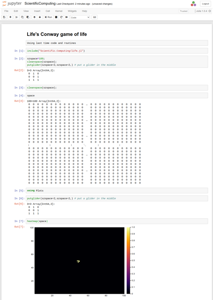
We now can better see the pattern which was so difficult to discern when scrambled in a table of 0 and 1. The default plotting is still far from satisfactory since colors are not particularly pretty, we don't need the barscale and the aspect ratio is favouring one dimension, with no reason. All this can be remedied with options:
heatmap(space,c=cgrad([:white, :black]), axis=nothing, legend=:none, aspect_ratio=1, yflip=true)

This will be best encapsulated in a function:
function plotspace(space)
    heatmap(transpose(space), c=cgrad([:white, :black]), axis=nothing, legend=:none, aspectratio=1, yflip=true)
end
Note that we transpose the space and flip the $y$ axis, so as to have the display read with the same conventions as the matrix (i.e., with (1,1) on the top left and (szspace, szspace) at the bottom right).
We can now let our Conway universe evolve: ![]() .
.
nextgen();plotspace(space)
which reveals the surprise first discovered by Richard Guy, that this little pattern replicates itself at the same time as it translates in the space. Things can move! This was actually discovered by following the evolution of the so-called r-pentomino, which was interesting Conway and his group for its capacity to live a very long time (this was one appeal of the system, to study its capacity to evolve in an irregular way for very long times). The evolution of the R-pentomino is worth visualizing. To have the computer—not us—iterate the calculation and update the plot so as to form a live animation, one can use the display() command from Plots. Like this, we can replicate this epic discovery of computer science:
cleanspace(szspace);
putrpentomino(szspace÷2,szspace÷2)
for i ∈ 1:200
    nextgen();
    display(plotspace(space))
    sleep(0.1) # pause a tenth of a second
end

If we prefer to save (or export) the animation for our records, we can use:
rpento = @animate for i ∈ 1:200
           nextgen();
           plotspace(space)
       end
gif(rpento, fps=5)
The irresistible movement of the glider is now clear on such an animation. This is a major result of computer science. The rules of the automaton are extremely simple: they bear no notion of objects beside that of a single-cell, and even less of notions such as mutation, movement, interactions, etc., and all this emerges all by itself from the rules. This led some people to postulate that the laws of Physics are similarly emerging from very basic rules. We will come back to that. For now, our emphasis being on graphical features, we will
gosper = @animate for i ∈ 1:1000
           nextgen();
           heatmap(space,c=cgrad([:white, :black]), axis=nothing, legend=:none, aspect_ratio=1, yflip=true)
       end
gif(gosper, fps=25)

From this point onward, we can literally seat and see: there is much that can be investigated, for instance, we could aim two guns at each other and see how they interact. This is one example out of many:
szspace=120;
cleanspace(szspace);
putGosperglidergun(2,2);
offsetx=29;
offsety=35;
space[szspace-offsetx:szspace-offsetx+9-1, szspace-offsety:szspace-offsety+36-1]=reverse(reverse(Gosperglidergun(),dims=1),dims=2)
gosper = @animate for i ∈ 1:500
           nextgen();
           plotspace(space)
       end
gif(gosper, fps=50)
We let you explore further, if you're puzzled by this simple universe, and will return to the study of ours.
Plotting bitmaps is of course not the most common application we want from a computer. Maybe the most wanted overall is to plot raw data, which typically comes as a list of points or a list of pair of points (to be interpreted in the $(x, y)$ or $y_1, y_2$ sense, making one or two curves, respectively). Let us look at examples. For instance, let us track a Collatz trajectory, for which we'll redefine slightly our collatz function so that it gives us a list of the elements:
function collatz(n)
    global lcol=[n];
    while n!=1
        if n%2==0
            n÷=2
        else
            n=3n+1
        end
        push!(lcol, n)
    end
    lcol
end
We have used push! to append the element to the list, so that we don't need to predefine arrays, given that we don't know their size ahead of time. There is also an append command which allows to append more than one element. Now we can see how the series evolves:
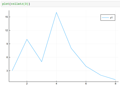
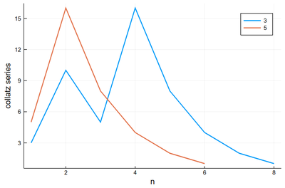
Once the data is plotted, we should make sure that the plot in its entirety is clear, accurate and complete. We can tweak the result with options till it's right. We will insist in particular in labelling axes in an informative way:
plot(collatz(3), lw=2, xlabel="n", ylabel="collatz series", label="3")
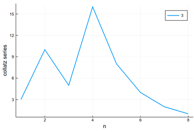
We can either use plot! to add to the previous result, as follows (Note that in Julia, ! refers to a function that alters its argument, we've seen that with push! already):
plot!(collatz(5), lw=2, xlabel="n", ylabel="collatz series", label="5")
or provide both datasets simultaneously:
plot([collatz(3), collatz(5)], lw=2, xlabel="n", ylabel="collatz series", label=["3" "5"])
In both cases the result produced is:
Like this it's easy to combine plots and computer programming:
p = plot()
for k ∈ 2:10
    global p=plot!(collatz(k), lw=2, xlabel="n", ylabel="collatz series", label=k)
end
p
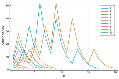
There is a lot of redundancy in this graph as various series collapse onto the same cycle. That makes for an interesting exercise for a better visualization of the Collatz series.
Plot the Collatz trajectories so that they overlap (i.e., plotting them from the end).
Maybe the trajectories of each series is not the most important, enlightening or interesting, baring exceptions:
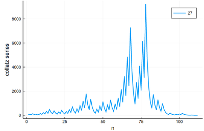
We would more interesting in, say, the lengths. Let's change our collatz function again:
function collatz(n)
    global counter=1;
    while n!=1
        if n%2==0
            n÷=2
        else
            n=3n+1
        end
        counter+=1;
    end
    counter
end
In which case it is trivial to plot the lengths:
plot([collatz(i) for i ∈ 1:100], xlabel="n", ylabel="Length", legend=:none)
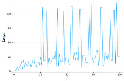
This is very chaotic (that's the main feature of the sequence, it is out of control). So we'd better plot the data directly. We can keep the lines as a guide:
plot([collatz(i) for i ∈ 1:100], xlabel="n", ylabel="Length", legend=:none, ls=:dot);
scatter!([collatz(i) for i ∈ 1:100], xlabel="n", ylabel="Length", legend=:none, color=:red)
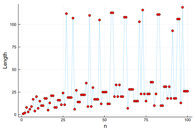
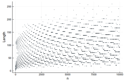
This is much better than our earlier (text-based) visualization that made us very impressed with 27 (we stopped at 30!) Here we see points with a greater lengths start to become commonplace.
scatter([collatz(i) for i ∈ 1:10000], xlabel="n", ylabel="Length", legend=:none, markersize=.75)
One can also turn to other types of markers:
Plots.supported_markers()
24-element Array{Symbol,1}:
 :none
 :auto
 :circle
 :rect
 :star5
 :diamond
 :hexagon
 :cross
 :xcross
 :utriangle
 :dtriangle
 :rtriangle
 :ltriangle
 :pentagon
 :heptagon
 :octagon
 :star4
 :star6
 :star7
 :star8
 :vline
 :hline
 :+
 :x
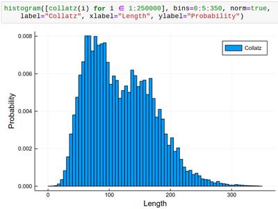
histogram([collatz(i) for i ∈ 1:250000], bins=0:5:350, norm=true,
    label="Collatz", xlabel="Length", ylabel="Probability")
Let us now look at something which interests us a lot as Physicists: Mathematical functions. Plotting them can be done as follows:
plot(sin, -π, π, lw=5, lc=:blue, legend=:top, label="Sin", xlabel="x")
plot!(x->x, -π, π, label="1st-order")
plot!(x->x-x^3/6, -π, π, label="2nd-order")
plot!(x->x-x^3/6+x^5/120, -π, π, label="3rd-order")
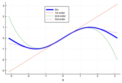
Here it is worth introducing the possibilities to label using $\mathrm{\LaTeX}$ inputs. We will need to be
using LaTeXStrings
after what one can:
plot(sin, -π, π, lw=5, lc=:blue, legend=:top, dpi=150,
    title="Taylor expansion", label=L"\sin(x)", xlabel=L"x",
    ylabel=L"\sum_{k=0}^\infty f^{(k)}(0){x^k\over k!}")
plot!(x->x, -π, π, label=L"x")
plot!(x->x-x^3/6, -π, π, label=L"x-x^3/6")
plot!(x->x-x^3/6+x^5/120, -π, π, label=L"x-x^3/6+x^5/120")
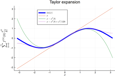
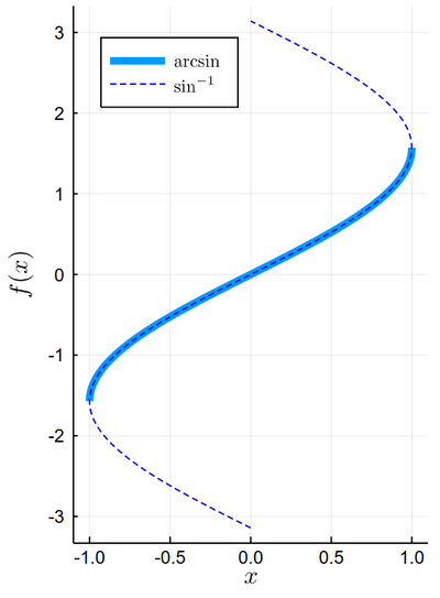
Note that plotting the function f between α and β with plot(f, α, β), it is assumed that the function $f(x)$ varies linearly on $x$, so this is equivalent to plotting plot(sin, x->x, -π/2, π/2) where we used the so-called pure function x->x for the identity. In this way, one can plot inverse functions, in the sense of reciprocal, by plotting the variable as a function of the function:
plot(sin, x->x, -π/2, π/2, lw=5, xlabel=L"x", ylabel=L"f(x)",dpi=150, label=L"\arcsin")
plot!(sin, x->x, -π, π, legend=:topleft, ls=:dash, color=:blue, label=L"\sin^{-1}", xlim=(-1.1, 1.1), aspectratio=1/2)
One can see how it is easy to make fairly sophisticated, interesting and aesthetically pleasing plots with relatively succinct code!
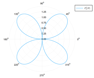
We will conclude by overviewing other types of plots, that will prove to be useful in the future. The following makes a plot in polar coordinates:
R(θ) = 3cos(θ)*sin(θ)
plot(R, 0:.01:2π, proj=:polar, lims=(0,1.5), dpi=150, label=L"P_2^1(\theta)")
This is showing the saddle function that we studied for its interesting partial-derivative properties, visualised as 3D plots. We also illustrate the concept of layouts or juxtaposing several plots into a single graph (the layout can be changed with layout=(2,1)):
x=-1:0.01:1
y=-1:0.01:1
h(x,y)=x^2-y^2;

p1=surface(x,y,h,
   xlabel=L"x", ylabel=L"y", zlabel=L"x^2-y^2");
p2=wireframe(x,y,h,
    xlabel=L"x", ylabel=L"y", zlabel=L"x^2-y^2");
plot(p1,p2)
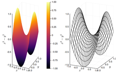
3D plots are notoriously difficult to read, if not more impacting for their visual look than for their actual usefulness to convey information. It is often better to turn to 2D density plots, which is the visual display with which we started, i.e., in julia, a heatmap:
x=-1:.01:1
y=-1:.01:1
heatmap(x, y, h, xlabel="x", ylabel="y", fill=true)
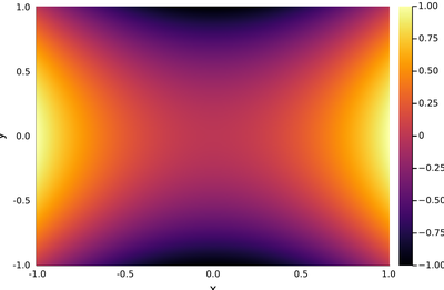
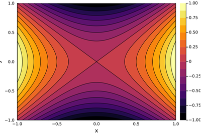
In some cases it may help to have isolines:
contour(x, y, f, xlabel="x", ylabel="y", fill=true)
If we want to plot a numerical array rather than a function, to keep the usual order x as horizontal and y as vertical, we need to define our matrix in this way:
dp=[h(x,y) for y=-1:.01:1, x=-1:.01:1];
in which case:
heatmap(x, y, dp, xlabel="x", ylabel="y")
The two above plots produce the same output:
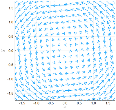
Finally, given our interest in electromagnetism this semester, we will conclude with a look at vector-field graphics, namely, showing at each point both the magnitude but also the direction of a given quantity. This is, for instance, a typical rotational field:
xs = -2:0.2:2
ys = -2:0.2:2

df(x, y) = [-y, x] ./ 7

xxs = [x for x in xs for y in ys]
yys = [y for x in xs for y in ys]

quiver(xxs, yys, quiver=df,
    aspectratio=1,xlims=(-1.75,1.75),ylims=(-1.75,1.75),xlabel=L"x", ylabel=L"y")
Computers are a great opportunity to make concrete and tangible otherwise abstract and obscure concepts. Eventually, most results they arrive to after crunching numbers through algorithms will be plotted in some form. We will have endless opportunities to explore that and refine our abilities to make useful, correct as well as beautiful plots.
Links
- Plots
- https://www.math.purdue.edu/~allen450/Plotting-Tutorial.html
- https://github.com/nassarhuda/JuliaTutorials/blob/master/plotting.ipynb
- Gallery of plots with Plots.jl.