Crash Course in Scientific Computing
V. Plotting
We'll be using the notebook feature. The main shortcuts are:
- toggle between edit (green) and command (blue) with esc and enter respectively.
- a and b to insert a cell above and below the current position.
- d d to delete the current cell
- z to undo
- m to transform a cell into markdown (text, documentation, etc.)
Plotting is not native in Julia, which you might regard as a pithy, since it's such a fundamental aspect of computer programming, but this is actually a feature, as it allows us to choose the plotting environment that we like. We are not limited to built-in plotting capacities. We will be using Plots:
using Plots
This is a plotting metapackage which brings many different plotting packages under a single API.
... Conway
heatmap(space,c=cgrad([:white, :black]), axis=nothing, legend=:none, aspect_ratio=1, yflip=true)
cellular automata
gosper = @animate for i ∈ 1:1000
           nextgen();
           heatmap(space,c=cgrad([:white, :black]), axis=nothing, legend=:none, aspect_ratio=1, yflip=true)
       end
gif(gosper, fps=25)
Plotting bitmaps is of course not the most common application we want from a computer. Maybe the most wanted overall is to plot raw data, which typically comes as a list of points or a list of pair of points (to be interpreted in the $(x, y)$ or $y_1, y_2$ sense, making one or two curves, respectively). Let us look at examples. For instance, let us track a Collatz trajectory, for which we'll redefine slightly our collatz function so that it gives us a list of the elements:
function collatz(n)
    global lcol=[n];
    while n!=1
        if n%2==0
            n÷=2
        else
            n=3n+1
        end
        push!(lcol, n)
    end
    lcol
end
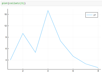
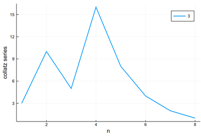
We have used push! to append the element to the list, so that we don't need to predefine arrays, given that we don't know their size ahead of time. There is also an append command which allows to append more than one element. Now we can see how the series evolves:
plot(collatz(3), lw=2, xlabel="n", ylabel="collatz series", label="3")
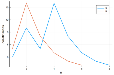
We can use plot! to add to the previous result. Note that in Julia, ! refers to a function that alters its argument (we've seen that with push! already):
plot!(collatz(5), lw=2, xlabel="n", ylabel="collatz series", label="5")
Like this it's easy to combine plots and computer programming:
p = plot()
for k ∈ 2:10
    global p=plot!(collatz(k), lw=2, xlabel="n", ylabel="collatz series", label=k)
end
p
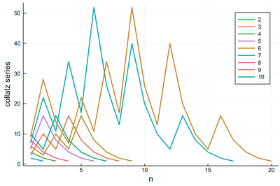
There is a lot of redundancy in this graph as various series collapse onto the same cycle. That makes for an interesting exercise for a better visualization of the Collatz series.
Maybe the trajectories of each series is not the most important, enlightening or interesting, baring exceptions:
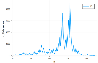
We would more interesting in, say, the lengths. Let's change our collatz function again:
function collatz(n)
    global counter=1;
    while n!=1
        if n%2==0
            n÷=2
        else
            n=3n+1
        end
        counter+=1;
    end
    counter
end
In which case it is trivial to plot the lengths:
plot([collatz(i) for i ∈ 1:100], xlabel="n", ylabel="Length", legend=:none)
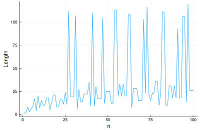
This is very chaotic (that's the main feature of the sequence, it is out of control). So we'd better plot the data directly. We can keep the lines as a guide:
plot([collatz(i) for i ∈ 1:100], xlabel="n", ylabel="Length", legend=:none, ls=:dot);
scatter!([collatz(i) for i ∈ 1:100], xlabel="n", ylabel="Length", legend=:none, color=:red)
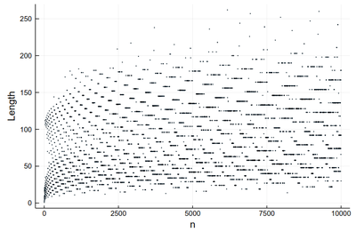
This is much better than our earlier (text-based) visualization that made us very impressed with 27 (we stopped at 30!) Here we see points with a greater lengths start to become commonplace.
scatter([collatz(i) for i ∈ 1:10000], xlabel="n", ylabel="Length", legend=:none, markersize=.75)
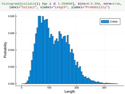
histogram([collatz(i) for i ∈ 1:250000], bins=0:5:350, norm=true,
    label="Collatz", xlabel="Length", ylabel="Probability")
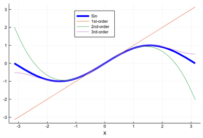
Let us now look at something which interests us a lot as Physicists: Mathematical functions. Plotting them can be done as follows:
plot(sin, -π, π, lw=5, lc=:blue, legend=:top, label="Sin", xlabel="x")
plot!(x->x, -π, π, label="1st-order")
plot!(x->x-x^3/6, -π, π, label="2nd-order")
plot!(x->x-x^3/6+x^5/120, -π, π, label="3rd-order")
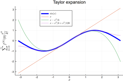
plot(sin, -π, π, lw=5, lc=:blue, legend=:top, dpi=150,
    title="Taylor expansion", label=L"\sin(x)", xlabel=L"x",
    ylabel=L"\sum_{k=0}^\infty f^{(k)}(0){x^k\over k!}")
plot!(x->x, -π, π, label=L"x")
plot!(x->x-x^3/6, -π, π, label=L"x-x^3/6")
plot!(x->x-x^3/6+x^5/120, -π, π, label=L"x-x^3/6+x^5/120")
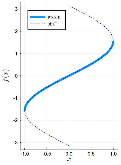
plot(sin, x->x, -π/2, π/2, lw=5, xlabel=L"x", ylabel=L"f(x)",dpi=150, label=L"\arcsin")
plot!(sin, x->x, -π, π, legend=:topleft, ls=:dash, color=:blue, label=L"\sin^{-1}", xlim=(-1.1, 1.1), aspectratio=1/2)
Other types of plots:
R(θ) = 3cos(θ)*sin(θ)
plot(R, 0:.01:2π, proj=:polar, lims=(0,1.5), dpi=150, label=L"P_2^1(\theta)")
2D, vector fields.