Our 2nd edition of Microcavities is going fast towards its 2nd edition.
It has been copy-edited by a company for Oxford University Press, and from the feedback we got, I get it that I will have to read about punctuation. Most of the comments (thousands of them) are about this. For instance, I should have not put a comma before "and" in the sentence you just read.
The topic of this blog, however, is about a slightly deeper trifle:

Here there are various issues, such as the spelling of "microdisk", for which there is even a Wikipedia page, and you see one correction of my faulty comma before "and" (I just did it again now as well).
The interesting feature is, the copy-editor wants to read: "In 5-μm GaAs microdics the embedded ..." (actually I think they would have wanted a comma after "microdisc" but I guess they get tired of so many corrections and actually a huge number slips through).
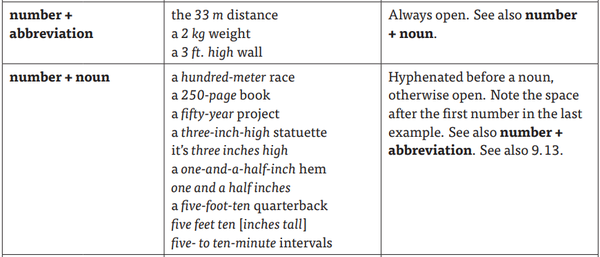
The point is about the hyphen between 5 and μm. The hyphen is wanted to make a compound word, since being 5 microns is a feature, or quality, of the object, and thus becomes an adjective.
The problem is that the underlying $\LaTeX$ code reads:
Similar effects for semiconductor quantum dots embedded in
microcavities have been demonstrated by \citet{bayer01a}. In
\SI{5}{\micro\meter} GaAs\index{GaAs} microdisks the embedded
from which you gather that I have no freedom to typeset the requested change. It does not compile if the first argument is not a numeric, and forcing it with the units gives:
That would be a bug of the siunitx package, would it be really needed. One can of course find a workaround, e.g.:
In 5-$\muup$m GaAs\index{GaAs} microdisks the embedded
with txfonts package. That produces:
which is nicer indeed, although at a semantic level, this breaks my document. Also, while the $\mu$ looks the same, the digit, interestingly, has changed. Anyway, the look of this does not seem even remotely familiar to anything I might have seen. In such case, one has to turn to the Chicago manual of style. There, I am delighted to read:

which makes the original version correct (at least by this standard).